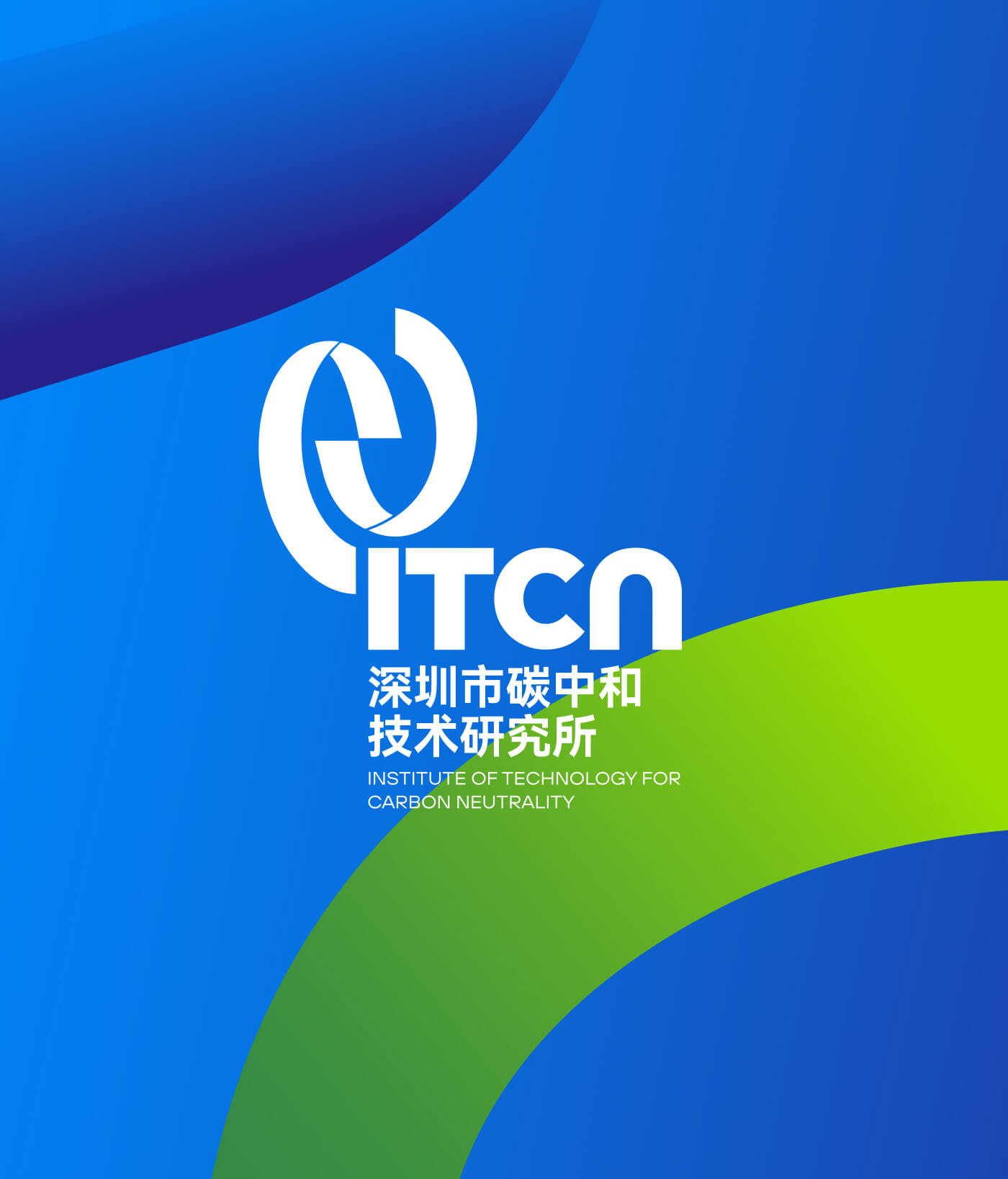
chengdu museum

chengdu museum

Branding / Promotional material / Wayfinding

Chengdu speaks to the world

In this design, we integrated the concept of dialog boxes into the creative materials of the museum. Inside the building, through color divisions, the overall guidance for the visit path on each floor is provided. At the same time, we integrated and classified information to better present information to the audience.

SANXINGDUI MUSEUM

SANXINGDUI MUSEUM

Wayfinding

Feel the mystery of ancient times

Walking into the new Sanxingdui Museum, we encountered the ancient Shu civilization. This time, modern design is used to dialogue with lost wisdom.

We hope that this time the wayfinding system can be "hidden" in the building, leaving the excitement to these mysterious cultural relics. At many points, we use transparent tempered glass to "float" information and make the space more transparent and cleaner.

The transparency of the glass, the delicateness of the screen printing , and the warmth of the copper plate make the signage come alive.

It took us half a year from the journey mapping to the final completion. Our positioning is accurate to every brick. We use simple and clear graphic language to allow visitors to navigate clearly in the museum.

Yong’an Urban Lake Forest Park

Yong’an Urban Lake Forest Park

Branding / creative products / Wayfinding

Hello Nature

In this concept, we directly use the image of a human as the branding elements of this park, instead of the common natural elements, such as the plants or mountains and waters.

We want to emphasize not only the beauty of nature, but also the people in nature and the rich life experience that nature can bring to us.

By visualizing the Chinese character "An" in the name of Yong’an Lake as a self-sufficient person in nature and highlighting the feet of the big steps, cheerful hair and squinting eyes. We create a group of characters depicting various activities in the park. We hope that these graphics can bring people closer to nature, awaken people’s interest for nature, guide people to relax in this park, encourage people to take steps and say Hi to nature, then step into and explore and enjoying this place.

BIO-TOWN CHENGDU

BIO-TOWN CHENGDU

Branding / Wayfinding

The home of global biological people

Bio-town, Chengdu’s most cutting-edge biological R&D cluster. The construction period of this town is 30 years, which covers R&D centers, factories, residential communities, schools and shopping mall, providing complete living facilities for scientists.

Over the past 8 years, we have provided this town with a full range of design from branding identity to environment design.

We extracted cells, genes and other elements from a biological perspective and integrated them into the design to form our own visual style.

ligne roset

ligne roset

Branding

A home furnishing brand with a history of 130 years

Ligne Roset is synonymous with modern luxury and invites consumers to enjoy a contemporary and avant-garde lifestyle.

We have provided promotional design services for this brand in China for three consecutive years. In each promotion, we combine the characteristics of each product with the corresponding nodes, and use minimalist design techniques to convey the brand's culture.

In terms of color, we all use low-saturation colors to maximize the style of the furniture itself. At the same time, minimalist expressions are used in layout to highlight the high-end tone of the brand.

mais

mais

branding / RETAIL STORE

ELEGANCE IN REBELLION

The brand comes from California, USA. In the brand planning and design, we chose pink and gray to emphasize the brand spirit. Interpret a sense of chicness and softness, bringing space for imagination. In the store, we have strengthened the display of art installations and applied them to the walls to create an abstract and dreamy feeling.

We chose the M in the brand name as the main pattern and extended it to all brand materials to form a unified visual symbol.

SCAINIM Technology

SCAINIM Technology

Brand Strategy / Visural ideneitty

THE LIMIT AND THE INFINITY

During the creation process, we were deeply shocked by the cell photos taken by SCAINIM’s optical microscope, the small histocytes on the slides used for pathological research look so magnificent and beautiful after being stained and magnified.

In logo design, we studied the imaging principle of the optical microscope, the flagship product of Shengqiang, from which we extracted the circles representing the lens and broken lines representing the light, logo graphics show the magic moment when light meets the lens, and the instruments capture the light source through the lens and focus on a point to enlarge the English brand name of Shengqiang, the beam of light further highlights the core technology of Shengqiang - scanning.

SYI TSING ENERGY TECH

SYI TSING ENERGY TECH

Branding

Technology makes the earth greener

SYI TSING Energy uses artificial intelligence to provide digital solutions for energy.

We have spent the past year injecting new insights into the brand.

The interlacing lines represent energy waves.We use four different colors to represent each energy. Flowing lines can become interesting and creative in animation and future communication.

We did not use the design methods of traditional technology companies, injecting more humanistic and artistic expression into Xiqing Energy, and stood out in the visual expression of similar companies.

Tianfu No.7 Primary School

Tianfu No.7 Primary School

Branding / creative products / Wayfinding

Design for the generation after 10s

In this case, we believe that the Chinese character "Ren" in the name of the Zhiren primary school is the key to the design concept.

We use low-saturation color bars and blocks like toy bricks in logo design and piece them together into an image-based Chinese character “Ren”, which represents the "benevolence" in children's mind - simple, kind, not so serious, colorful and interesting.We have also shaped a changeable ghost horse elf as the school's IP, it has horns on its head and a tail, it is not a horse, nor a unicorn, just like the children of this age, who are open minded, smart and unique, and are eager to prove themselves, but cannot be defined.

wwf

wwf

Promotional materials

A future for people and nature

WWF, an independent conservation organization, is a global leader in tackling the world’s most complex environmental challenges facing people and nature.

In China, WWF has many projects underway, among which we participate in Giant panda and Snow Leopard Conservation Program.

We did promotional design for these two projects. Visually, we use pictures to take the lead and increase the visual impact by showing the eyes of animals. In terms of form, we used different folding methods to make the flyer look more interesting.

West China Stomatological Hospital

West China Stomatological Hospital

Re-branding / wayfinding

Smiles all the way

West China Dental Hospital was established in 1907. Because the LOGO cannot be changed, we created graphics element of the brand to bring new vitality to this hospital.

This time, we have injected the concept of "smile" into the hospital's DNA.We integrated the smile symbol into each department and promotional materials to form a consistent brand experience.At the same time, interesting colors are used to distinguish each department. The shape of our teeth and the symbol of smile are combined to form a unique brand visual system for our hospital.